这篇文章主要介绍了HTML使用栅格布局实现六种筛子的样式,本文通过实例代码给大家介绍的非常详细,对大家的学习或工作具有一定的参考借鉴价值,需要的朋友可以参考下
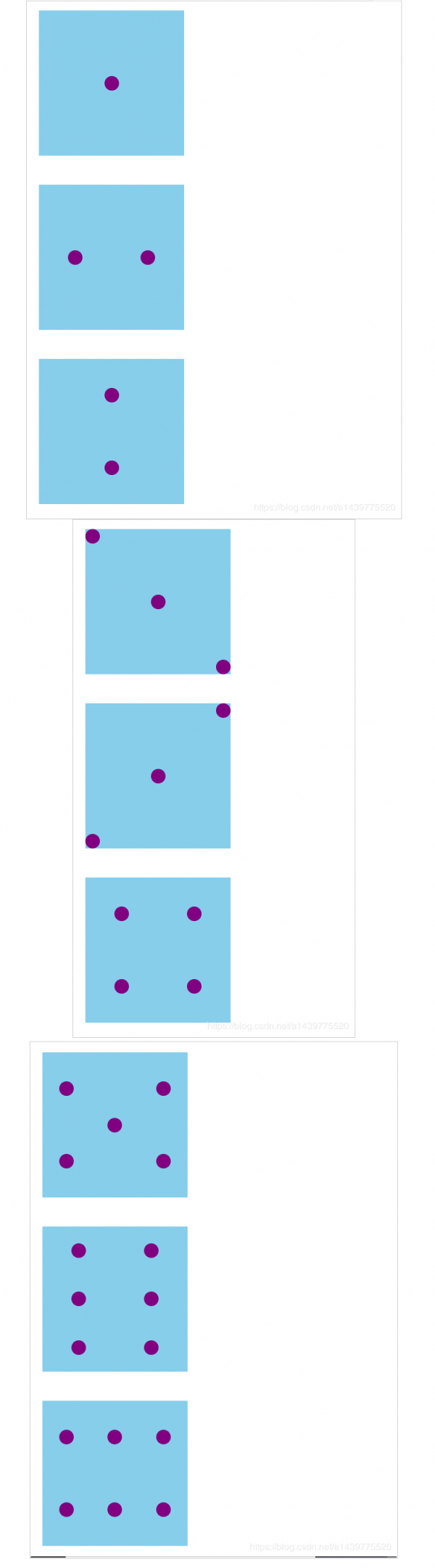
先上效果图下面附上代码
<!DOCTYPE html>
<html>
<head>
<meta charset="UTF-8">
<title></title>
<style type="text/css">
.big {
width: 100px;
height: 100px;
background: skyblue;
display: flex;
margin-top: 20px;
}
.small {
width: 10px;
height: 10px;
background: purple;
border-radius: 5px;
}
.one {
display: flex;
justify-content: center;
/*交叉轴*/
align-items: center;
}
.two {
display: flex;
justify-content: space-around;
align-items: center;
}
.two2 {
display: flex;
flex-direction: column;
justify-content: space-around;
align-items: center;
}
.three {
display: flex;
flex-direction: column;
justify-content: space-between;
align-items: center;
}
.four {
display: flex;
justify-content: space-around;
}
.four1 {
display: flex;
justify-content: space-around;
align-items: center;
}
.four2 {
display: flex;
flex-direction: column;
justify-content: space-around;
align-items: center;
}
.five {
display: flex;
justify-content: space-around;
}
.five1 {
display: flex;
flex-direction: column;
justify-content: space-around;
align-items: center;
}
.five2 {
display: flex;
flex-direction: row;
align-self: center;
}
.six {
display: flex;
justify-content: space-around;
}
.six1 {
display: flex;
flex-direction: column;
justify-content: space-around;
align-items: center;
}
</style>
</head>
<body>
<div class="big one">
<div class="small"></div>
</div>
<div class="big two">
<div class="small"></div>
<div class="small"></div>
</div>
<div class="big two2">
<div class="small"></div>
<div class="small"></div>
</div>
<div class="big three">
<div class="small" style="align-self: flex-start;"></div>
<div class="small" style="align-self: center;"></div>
<div class="small" style="align-self: flex-end;"></div>
</div>
<div class="big three">
<div class="small" style="align-self: flex-end;"></div>
<div class="small" style="align-self: center;"></div>
<div class="small" style="align-self: flex-start;"></div>
</div>
<div class="big four">
<div class="four2">
<div class="small"></div>
<div class="small"></div>
</div>
<div class="four2">
<div class="small"></div>
<div class="small"></div>
</div>
</div>
<div class="big five">
<div class="five1">
<div class="small"></div>
<div class="small"></div>
</div>
<div class="five2">
<div class="small"></div>
</div>
<div class="five1">
<div class="small"></div>
<div class="small"></div>
</div>
</div>
<div class="big six">
<div class="six1">
<div class="small"></div>
<div class="small"></div>
<div class="small"></div>
</div>
<div class="six1">
<div class="small"></div>
<div class="small"></div>
<div class="small"></div>
</div>
</div>
<div class="big six">
<div class="six1">
<div class="small"></div>
<div class="small"></div>
</div>
<div class="six1">
<div class="small"></div>
<div class="small"></div>
</div>
<div class="six1">
<div class="small"></div>
<div class="small"></div>
</div>
</div>
</body>
</html>
总结
到此这篇关于HTML使用栅格布局实现六种筛子的样式的代码详解的文章就介绍到这了,更多相关html 栅格布局 内容请搜索脚本之家以前的文章或继续浏览下面的相关文章,希望大家以后多多支持脚本之家!
来源:脚本之家
链接:https://www.jb51.net/web/728714.html
申请创业报道,分享创业好点子。点击此处,共同探讨创业新机遇!